

로고 그 이상: 맞춤형 피자 박스 디자인의 이면에 숨겨진 과학과 공학
고객과의 연결은 결제 단계에서 끝나는 것이 아니라, 배달 기사가 상자를 건네줄 때 비로소 본격적으로 시작됩니다. 여전히 많은 식당들이 포장재를 일회용 부수적인 요소로만 여깁니다. 하지만 사실 맞춤형 피자 상자는 정교하게 설계된 보온 용기이며, 종종 고객 집에서 브랜드를 대표하는 유일한 실물 아이템이기도 합니다. 상자가 제 역할을 하지 못하면, 아무리 재료가 완벽하더라도 음식은 망가지고 맙니다. 이 가이드는 겉으로 드러나는 미적 요소 그 이상을 살펴봅니다. 이 가이드에서는 최고의 피자 상자를 디자인하는 데 필요한 열역학, 재료 과학, 공급망 전략을 상세히 분석하여, 눈에 띄는 브랜딩과 흠잡을 데 없는 산업적 성능 사이의 간극을 메워 드리겠습니다.
피자 상자 디자인이 브랜드를 위한 가장 과소평가된 마케팅 도구인 이유
포장의 진정한 상업적 중요성을 이해하려면 먼저 ‘개봉 시 마찰(Unboxing Friction)’이라는 개념을 분석해야 합니다. 소비자가 프리미엄 피자를 주문할 때, 그들은 크러스트의 바삭함, 치즈의 최적의 녹는 온도, 토핑에서 풍기는 생동감 넘치는 향기 등 기대되는 감각적 경험을 위해 비용을 지불하는 것입니다. 그러나 업계 데이터에 따르면, 테이크아웃 고객의 식품 품질 관련 불만 중 60% 이상은 주방 측의 실수가 아니라 치명적인 포장 결함에서 비롯된 것으로 나타났습니다. 피자가 미지근한 상태로 배달되고 바닥 크러스트가 축축해져 있다면, 소비자는 열역학 법칙을 탓하지 않고 바로 귀사의 브랜드를 탓할 것입니다. 이러한 마찰은 고객 충성도를 순식간에 끊어 버리고 재구매 가능성을 급격히 낮춥니다.
피자 상자는 제품을 물리적으로 보호하는 기능을 넘어, 시각 중심의 소셜 미디어가 주류를 이루는 시대에 이동식 광고판 역할도 합니다. 수만 달러를 디지털 마케팅, 검색 엔진 최적화(SEO), 인플루언서 협업에 투자한 식당이, 정작 자사의 프리미엄 제품을 평범하고 텅 빈 골판지 상자에 담아 배송한다고 상상해 보십시오. 참여도가 높은 고객이 식사를 사진으로 찍어 인스타그램이나 틱톡 같은 플랫폼에 공유할 때, 브랜드 정체성은 전혀 드러나지 않습니다. 이 식당은 사실상 자신들에게 주어진 가장 강력하고 자연스러운 마케팅 기회를 포기한 셈입니다.
또한, B2B 구매 생태계에서 패키지 디자인은 운영 성숙도를 직접적으로 반영합니다. 대규모 프랜차이즈 및 지역 체인의 경우, 일반적인 상자에서 맞춤형으로 설계된 패키지 솔루션으로 전환하는 것은 상품화된 서비스에서 프리미엄 브랜드 경험으로의 전환을 의미합니다. 포장은 시각적 접촉 후 3초 이내에 브랜드의 가치 제안을 전달해야 할 뿐만 아니라, 내부 제품을 보호하기 위해 흠잡을 데 없는 물리적 성능을 발휘해야 합니다. 이러한 균형을 맞추기 위해서는 단순한 그래픽 디자인을 넘어 포장 엔지니어링의 영역으로 나아가야 합니다.

피자 포장재의 물리학: 보온 효과 대 수분 조절
피자 상자 설계에서 가장 큰 난제는 열역학의 근본적인 모순, 즉 잠열을 유지하면서 동시에 과도한 수분을 배출해야 하는 과제를 해결하는 것입니다. 500도 상업용 오븐에서 나온 피자는 엄청난 양의 수증기를 활발히 방출하고 있습니다. 만약 포장재 구매 담당자가 보온성을 최우선으로 삼아 완전히 밀폐된 상자를 선택한다면, 의도치 않게 제품을 망가뜨리는 파괴적인 미기후를 조성하게 됩니다.
통기 구멍: 빵 껍질이 축축해지는 것을 방지하는 비결
여기서 작용하는 핵심 메커니즘은 ‘수분 방출 속도’입니다. 갓 구워낸 피자를 통풍이 잘 되지 않는 골판지 상자에 넣으면, 뜨거운 반죽과 소스에서 뿜어져 나오는 수증기가 상자 내부의 차가운 천장에 닿게 됩니다. 응결 과정을 통해 이 수증기는 액체 상태의 물로 변한 뒤, 필연적으로 피자 위로 다시 떨어지게 됩니다. 이러한 온실 효과는 크러스트에 바삭한 식감과 복합적인 풍미를 부여하는 화학 반응인 ‘마이야르 반응’을 방해하여, 업계에서 가장 우려하는 결과인 ‘축축한 크러스트’를 초래합니다.
이를 해결하기 위해 구조 엔지니어들은 정밀하게 조정된 환기 시스템을 활용합니다. 표준 12인치 상업용 피자 상자의 경우, 일반적으로 반지름이 1.5센티미터인 반달 모양의 통풍구 2~4개를 전략적으로 배치해야 합니다. 이 통풍구들은 상단부가 아닌 측면이나 후면 패널에 위치해야 하며, 그래야만 수분을 머금은 가벼운 뜨거운 공기가 자연스럽게 빠져나가면서 치즈를 식게 만드는 풍동 효과를 일으키지 않습니다. 이 다이컷 통풍구의 정확한 표면적은 상자의 부피와 수학적으로 균형을 이루어야 합니다. 이는 증기가 응결되는 속도보다 빠르게 빠져나가면서도, 치즈가 굳는 임계 온도 이상으로 내부 온도를 유지할 수 있을 만큼 충분히 느린 속도로 배출되도록 보장하기 위함입니다.
내부 단열 전략: 골판지 찌그러짐 방지
환기는 수증기를 조절하는 역할을 하지만, 상자의 핵심 열 에너지를 유지하려면 압력을 받았을 때 재료의 내구성에 대한 깊은 이해가 필요합니다. 피자 상자에서 열이 급격히 손실되는 가장 흔한 원인은 외부 공기가 아니라, “골판지 찌그러짐(Corrugated Crush)”으로 알려진 구조적 결함입니다. 골판지 상자의 단열 성능은 종이 자체에서 비롯되는 것이 아니라, 골이 파인 코어 층 안에 갇힌 공기 주머니에서 비롯됩니다.
피자에서 나온 고온의 기름과 지방이 상자 내부의 라이너를 투과하면, 치명적인 물리적 연쇄 반응이 일어납니다. 종이 섬유가 기름에 흠뻑 젖어 인장 강도를 잃게 됩니다. 피자의 무게와 주변 환경의 습기로 인해 주름진 아치 구조가 무너집니다. 주름이 으스러지면, 공기를 가두어 단열 기능을 하는 중요한 층이 순식간에 파괴됩니다. 상자는 단열재에서 열전도체로 변모하여, 피자에서 열을 빠르게 흡수해 외부 환경으로 전달하게 됩니다.
따라서, 첨단 내부 단열 전략을 적용하려면 고성능 내유성 차단재의 사용이 필수적입니다. 내유성 지수가 높은 특수 코팅재나 고밀도 크라프트 라이너를 활용함으로써, 포장재는 기름이 골판지 홈으로 스며드는 것을 방지합니다. 이를 통해 골판지 코어의 구조적 무결성이 유지되며, 배송 과정 내내 상자 내부의 열을 효과적으로 가두는 공기 주머니가 보존됩니다.
재료 과학: 골판지 플루트와 외부 라이너의 원리 이해
B2B 조달 전문가들에게 포장재의 사양을 파악하는 일은 쉽지 않은 과제일 수 있습니다. 단순히 “고품질 상자”를 요청하는 것만으로는 부족하며, 골판지의 정확한 구조를 구체적으로 명시해야 합니다. 골판지는 두 개의 평평한 라이너보드(외부 및 내부 표면) 사이에 주름진 중간층(코어)이 끼워진 복합 소재입니다. 올바른 조합을 선택하는 것은 구조적 성능과 시각적 연출 모두에 있어 매우 중요합니다.
구조적 무결성: E-플루트와 B-플루트 중 선택하기
골판지 심지는 피자 상자의 골격 역할을 하며, 상자의 적재 강도, 강성 및 내충격성을 결정합니다. 외식 업계에서는 B-플루트와 E-플루트라는 두 가지 프로파일을 중심으로 논의가 이루어지고 있습니다.
B-플루트는 피자 업계에서 가장 견고한 주력 제품입니다. 두께가 약 3밀리미터이고 1리니어 피트당 약 47개의 플루트가 있어 뛰어난 내압성과 견고한 적재 강도를 자랑합니다. 따라서 B-플루트는 14인치나 16인치 상자와 같이 크기가 큰 제품이나, 상당한 하향 압력을 가하는 무겁고 두꺼운 딥디시 피자 상자에 필수적인 선택입니다. 또한 B-플루트 내부의 더 큰 공기 주머니는 장거리 배달 시 약간 더 뛰어난 단열 효과를 제공합니다.
반면, E-플루트는 두께가 약 1.5밀리미터에 불과하고 1선형피트당 약 90개의 플루트가 배열되어 있어 훨씬 더 얇은 구조를 자랑합니다. B-플루트만큼의 막강한 강도는 부족하지만, E-플루트는 두 가지 큰 장점 덕분에 12인치 이하의 얇은 크러스트 피자 시장에서 압도적인 점유율을 차지하고 있습니다. 첫째, 슬림한 구조 덕분에 식당에서는 동일한 창고 면적에 최대 50% 더 많은 상자를 보관할 수 있어, 매우 귀중한 주방 뒤편 공간을 최적화할 수 있습니다. 둘째, 플루트의 높은 밀도 덕분에 외부 라이너에 더 매끄럽고 평평한 인쇄 표면이 형성되어, 인쇄기가 B-플루트 보드의 넓은 틈새에 압력을 가할 때 발생하는 눈에 띄는 줄무늬 현상인 ‘워시보드 효과’를 획기적으로 줄여줍니다.
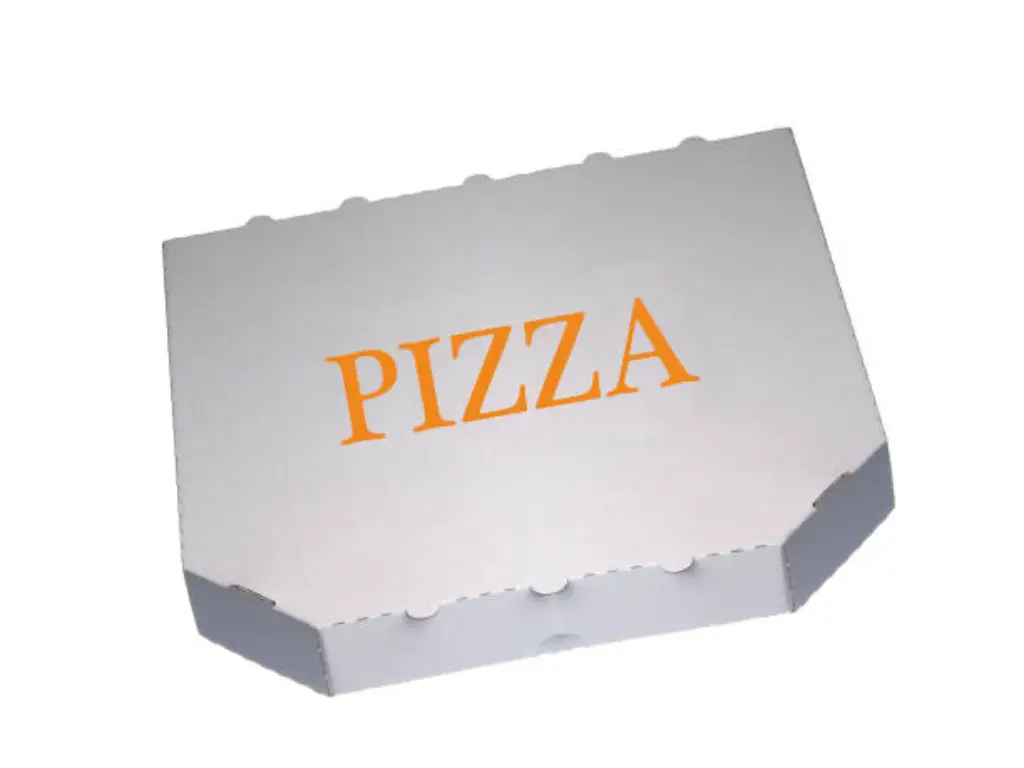
표면 및 인쇄 적합성: 크라프트 라이너 대 화이트 라이너
홈이 파인 중간층을 골격에 비유한다면, 라이너보드는 피부에 해당합니다. 외부 라이너의 선택은 인쇄된 디자인의 시각적 결과물과 브랜드의 인지 가치를 근본적으로 좌우합니다. 주요 선택지로는 천연 크라프트지와 표백된 백색 보드가 있습니다.
크래프트 라이너는 표백하지 않은 목재 펄프로 제조되어 자연스러운 갈색과 질감 있는 외관을 유지합니다. 브랜딩 관점에서 볼 때, 크래프트는 장인 정신, 소박함, 친환경적인 정체성을 즉각적으로 전달합니다. 물리적 특성상 크래프트지는 다공성이 매우 뛰어나고 흡수력이 높습니다. 그러나 이러한 흡수력은 그래픽 디자인에 있어 상당한 난제를 야기합니다. 크래프트지는 스펀지처럼 작용하여 액체 잉크가 번지게(도트 게인) 하고 외관을 변형시키기 때문입니다. 크래프트지에 밝은 시안색 로고를 인쇄하면 갈색 배경과 섞여 밋밋하고 탁한 녹색으로 변합니다. 따라서 크래프트지는 검정, 짙은 네이비, 포레스트 그린 등 대비가 높은 어두운 별색을 활용한 미니멀한 디자인에 엄격히 권장됩니다.
화이트 라이너, 특히 점토 코팅된 화이트 보드는 깨끗하고 밀폐된 캔버스를 제공합니다. 표백 공정과 표면 처리를 통해 잉크 흡수를 방지하므로, 잉크가 종이 섬유 표면에 선명하게 자리 잡을 수 있습니다. 그 결과 매우 넓은 색 재현 범위를 확보하여, 복잡한 CMYK 프로세스 인쇄, 사실적인 이미지, 그리고 채도가 높은 브랜드 색상을 완벽하게 구현할 수 있습니다. 디지털 플랫폼에서 시선을 사로잡기 위해 생동감 넘치고 과감한 미학을 내세우는 프랜차이즈의 경우, 높은 시각적 결함률을 방지하기 위해 고품질 화이트 라이너에 투자하는 것은 필수적입니다.
B2B 조달을 위한 표준 치수 및 다이라인 템플릿
맞춤형 포장재 조달 과정에서 발생하는 중대한 문제점은 프리프레스 단계에서 발생하는데, 이때 그래픽 디자이너들이 공학적으로 설계된 구조용 템플릿 대신 임의의 캔버스 크기를 기준으로 아트웍을 제작하기 때문입니다. B2B 제조 워크플로우에서는 정밀성이 무엇보다 중요합니다. 아트웍과 실제 절단 다이의 차이가 단 몇 밀리미터에 불과하더라도, 수천 달러에 달하는 판 수정 비용이 발생하고 생산이 몇 주나 지연될 수 있습니다.
보편적인 기준을 마련하기 위해 전 세계 외식업계는 표준화된 피자 상자 크기. 이 치수는 내부 사용 가능 공간을 나타내며, 피자가 운송 중에 미끄러지거나 가장자리가 손상되는 것을 방지할 수 있도록 정확하게 맞도록 설계되었습니다. 이에 상응하는 외부 치수는 선택한 골판지의 두께에 따라 약간 더 커집니다.
| 표준 피자 크기 | 내부 치수 (폭 × 길이) | 권장 깊이/높이 | 최적의 플루트 형상 |
|---|---|---|---|
| 10인치 (소형/개인용) | 10.125인치 × 10.125인치 | 1.50″ | E-플루트 |
| 12인치 (중형) | 12.125인치 × 12.125인치 | 1.50″ – 1.75″ | E-플루트 또는 B-플루트 |
| 14인치 (대형) | 14.250인치 × 14.250인치 | 1.75″ | B-플루트 |
| 16인치 (엑스트라 라지) | 16.250인치 × 16.250인치 | 1.75″ – 2.00″ | B-플루트 |
대량 생산을 위한 파일을 준비할 때는 반드시 제조업체에서 제공한 다이라인 파일을 기반으로 작업해야 합니다. 이 엔지니어링 도면에는 절대 변경해서는 안 되는 세 가지 레이어가 포함되어 있습니다. 이 블리드 라인 인쇄되지 않은 흰색 테두리가 생기지 않도록 하기 위해 작품이 절단선 밖으로 얼마나 더 튀어나와야 하는지 지정합니다. 이 점수 기록 중장비가 판지를 접게 될 부분을 나타내며, 이에 따라 디자이너들은 중요한 텍스트를 이러한 접힘 영역에서 멀리 떨어뜨려야 합니다. 마지막으로, Dielines themselves map the exact path of the steel cutting blades. Proper utilization of these industrial parameters ensures a frictionless transition from digital concept to physical reality.
Designing for ROI: Balancing Visual Trends with Plate Costs
Transitioning from the structural engineering to the visual surface, procurement teams must analyze graphic design through the lens of Return on Investment (ROI). While aesthetic trends frequently shift, the fundamental mathematics of industrial printing remain constant. Every design choice has a direct, calculable impact on the per-unit cost and the initial capital expenditure required for tooling.
The contemporary packaging landscape is defined by the tension between Minimalism and Maximalism. Maximalist designs, characterized by edge-to-edge illustrations, complex gradients, and full-bleed backgrounds, are incredibly effective at capturing attention in a crowded feed. However, they carry a hidden financial burden. In industrial packaging, each specific color requires the creation of a dedicated photopolymer printing plate. A full-color CMYK maximalist design requires a minimum of four expensive plates, plus potential additional plates for spot colors or varnishes. Furthermore, designs with an exceptionally high Ink Coverage Percentage consume vast amounts of ink per unit, driving up the variable cost of each box significantly.
Conversely, a strategic Minimalist approach can drastically optimize profit margins while maintaining a premium brand perception. By leveraging the negative space of the kraft or white linerboard as the primary background color, brands can create striking visuals using only one or two spot colors. This approach not only slashes the initial plate costs and per-unit ink consumption but also mitigates the risk of printing errors such as color registration shift. For the B2B buyer, intelligent design is not just about looking good; it is about engineering a graphic layout that maximizes brand impact while minimizing manufacturing overhead.
Industrial Printing Standards: Aligning Flexo and Offset with Your Design
The visual complexity of your finalized artwork will definitively dictate the industrial printing methodology required to produce it. For foodservice brands scaling their operations, understanding the hard boundaries between Flexography (Flexo) and Offset Lithography (Offset) is crucial to avoiding disastrous production outcomes.
Flexographic printing operates like a sophisticated, high-speed rotary rubber stamp. It is the undisputed champion of volume and cost-efficiency, ideal for production runs exceeding 50,000 units. However, Flexo has strict technical limitations; it struggles with fine gradients and micro-typography, making it the perfect partner for bold, minimalist, vector-based designs utilizing 1 to 3 solid spot colors. Attempting to force a highly complex photographic design through a Flexo press will inevitably result in severe “dot gain,” where the ink spreads uncontrollably, resulting in a blurry, unprofessional image.
For brands demanding uncompromising, photorealistic detail and edge-to-edge CMYK color fidelity, Offset printing (specifically Litho-lamination) is the mandatory solution. This process prints the artwork onto a high-quality paper sheet first, which is then laminated onto the corrugated board, entirely bypassing the fluted texture. While the setup costs and minimum order quantities are higher, the visual results are unparalleled.
For growing restaurant chains demanding both visual excellence and rigorous cost control, compromising on printing technology is not an option. A top-tier manufacturing partner must possess the infrastructure to adapt to your specific design requirements. As an industry leader with over 24 years of packaging expertise and an annual production capacity of 16 billion units, 길 operates an elite facility equipped with over 100 specialized machines, fully supporting both high-speed Flexography and high-fidelity Offset printing. Furthermore, recognizing the paramount importance of consumer safety, Yoonpak utilizes advanced Pantone (PMS) matching systems coupled exclusively with low-migration, food-grade soy and water-based inks. This ensures that whether your strategy demands a cost-effective, high-volume minimalist run or a complex, full-color brand statement, the execution will achieve perfect industrial reproduction with absolutely zero risk of toxic odor transfer to the food.
Compliance and Food Safety: Aqueous Coatings and FDA Standards
As international supply chains tighten and consumer awareness peaks, the regulatory landscape surrounding food contact packaging has become a high-stakes minefield. A design that is structurally sound and visually stunning is completely useless if it fails to pass customs inspections or, worse, triggers a public health crisis due to chemical leaching.
A widespread and dangerous misconception in the eco-packaging sector is the blind application of standard PLA (Polylactic Acid) linings to hot food containers. While PLA is a commendable compostable material for cold beverage cups, its thermal limitations render it hazardous for pizza boxes. Standard PLA begins to soften and degrade at temperatures exceeding 40°C to 50°C. When subjected to the intense heat and steam of a freshly baked pizza, a PLA liner will melt, fusing the packaging directly to the food surface and causing catastrophic structural failure.
To navigate the extreme thermodynamics of pizza delivery while maintaining regulatory compliance, industry experts specify the use of advanced Aqueous Coatings (water-based barrier coatings) or specialized Clay-coated Kraft boards. These engineered surfaces provide an exceptionally high Grease Resistance Index, successfully repelling hot oils without relying on petroleum-based plastics.
Furthermore, procurement directors must be hyper-vigilant regarding the global phase-out of PFAS (per- and polyfluoroalkyl substances), historically used as cheap grease-proofing agents. Deploying PFAS-laden boxes exposes a brand to severe legal liabilities and massive border rejections in regions like Europe and North America. Validating a supplier requires demanding hard documentation: strict adherence to FDA and European LFGB food contact standards, verifiable FSC (Forest Stewardship Council) certification for sustainable paper sourcing, and absolute confirmation of a PFAS-free manufacturing process. Compliance is no longer a marketing buzzword; it is the ultimate corporate risk isolation wall.
Conclusion: Scaling Your Brand with the Right Packaging Partner
The journey from a conceptual brand logo to a high-performance, mass-produced custom pizza box is fraught with complex engineering challenges. Balancing the thermodynamic requirements of moisture release against heat retention, selecting the optimal flute profile to prevent corrugated crush, and aligning graphic design complexities with the harsh realities of flexographic plate costs require a level of technical mastery that goes far beyond basic procurement.

A flawless 3D digital mockup is an illusion if it is handed over to a supplier lacking the infrastructure and quality control to execute it at scale. You require a manufacturing backbone that combines the agile responsiveness of a boutique firm with the unshakeable reliability of a global industrial giant. For over two decades, 길 has served as the silent force behind international foodservice titans like Burger King and Tim Hortons, engineering packaging solutions that perform flawlessly under extreme commercial pressure. By securing raw materials exclusively from internationally certified mills like Sun Paper, and enforcing a zero-defect quality control matrix featuring hourly inspections and box-side batch coding for total traceability, we eliminate the supply chain black box. Furthermore, our optimized production lines compress standard lead times to just 3 to 6 weeks—averaging 7 days faster than the industry benchmark—complemented by up to one month of free warehouse staging to maximize your cash flow and inventory agility.
Transforming your packaging from a basic commodity into a high-ROI brand asset requires rigorous physical testing and structural validation. To ensure the highest level of engineering precision before mass production, we offer a rapid 48-hour sample dispatch service. Standard stock samples are provided completely free of charge to allow you to assess material quality, while custom structural designs and printed prototypes are subject to a standard tooling fee, with freight costs collected. Stop allowing compromised packaging engineering to degrade your culinary excellence and erode your brand equity. Secure your supply chain and elevate your customer’s first moment of truth by partnering with a manufacturer built for global scale. Ready to upgrade your structural design? Feel free to contact Yoonpak today to discuss your technical specifications with our engineering team.


 English
  German
  Spanish
  Italian
  Dutch
Dutch  French
  Portuguese
  Russian
  Arabic
  Korean