The Ultimate Guide to Food Packaging Design: Rules, Costs & Trends
For many emerging brands and seasoned fast-moving consumer goods (FMCG) executives alike, food packaging design is often misunderstood as a purely aesthetic endeavor. The reality is far more unforgiving. A beautiful rendering on a designer's screen means absolutely nothing if the physical material fails to preserve the product's freshness, violates federal labeling laws, or bankrupts your profit margins before the first unit even hits the grocery store shelf. In this comprehensive 2026 guide, we will strip away the artistic fluff and dissect the uncompromising intersection of material science, legal compliance, and supply chain economics. Whether you are launching a premium cold brew coffee line or scaling a global fast-food franchise, this guide will equip you with the exact blueprints, cost analyses, and manufacturing secrets required to create packaging that protects your product, captivates your buyer, and scales flawlessly.
The Anatomy of Effective Food Packaging Design
To fundamentally master food packaging design, one must first break free from the illusion that packaging equals graphic design. In the high-stakes environment of retail food and beverage, packaging is a rigorous physical engineering discipline. It operates under a strict, unforgiving paradigm known as the "Impossible Triangle": Shelf Impact, Product Preservation, and Cost-Efficiency. Achieving any two is relatively easy; mastering all three is what separates transient startups from household brands.
The brutal truth of retail is governed by the First Moment of Truth (FMOT) theory. When a consumer walks down a supermarket aisle, you have exactly three seconds to arrest their visual attention and communicate your value proposition. Statistics across the FMCG sector routinely demonstrate that a packaging redesign can trigger a sales fluctuation of up to +/- 30%. However, getting them to pick up the product is only half the battle. If the food inside has degraded prematurely due to poor material selection, you will face the Zero Moment of Truth failure—a disastrous customer review and zero repeat purchases. Therefore, the foundational formula for success is undeniably clear: Effective Design = Visual Psychology + Material Science + Regulatory Compliance.
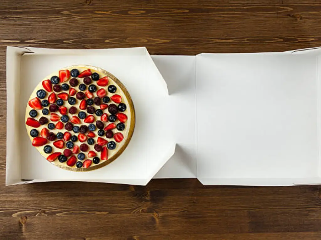
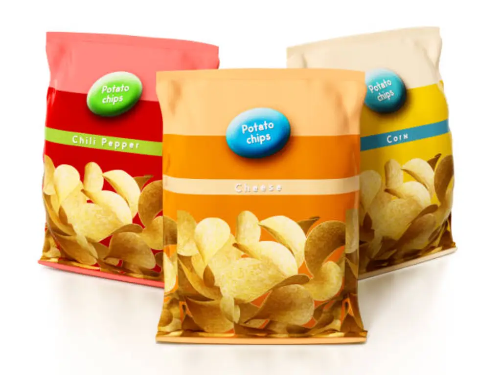
Consider the ubiquitous potato chip bag. To an amateur, it is just a glossy plastic wrapper with a vibrant logo. To a packaging engineer, it is a masterclass in functional design. The bag is intentionally inflated not to deceive the consumer, but because it is flushed with nitrogen gas to prevent the delicate chips from being crushed in transit and to displace oxygen, thereby stopping the frying oils from turning rancid. The interior is coated with a microscopic layer of aluminum (metallized film) to completely block ultraviolet light, which accelerates food degradation. This simple everyday item proves that brilliant packaging design begins with understanding the physical vulnerabilities of the food itself. Form must always follow functional preservation.
The Physical Foundation: Material Science & Structural Engineering
In authentic packaging engineering, graphic design cannot begin until the physical foundation is laid. The specific substrate you choose (material science) directly dictates how the package will be cut, folded, and sealed (structural engineering). Separating these two steps is a guaranteed recipe for manufacturing failure. As we navigate deeper into the 2020s, brands are caught in a violent tug-of-war between the physical necessity of extending shelf life and the consumer-driven mandate for sustainable food packaging.
Barrier Properties and Product Shelf Life
When engineers evaluate packaging materials, they do not look at color or texture; they look at microscopic permeability. According to standards set by ASTM International, the survival of your food product depends on two critical acronyms: OTR (Oxygen Transmission Rate) and WVTR (Water Vapor Transmission Rate). If your packaging fails to block oxygen, aerobic bacteria thrive, and fats oxidize. If it fails to block water vapor, crisp products become soggy, and dry powders clump into solid bricks.
| Material Structure (Physical Layers) | Best For (Food Categories) | OTR (Oxygen Barrier) | WVTR (Moisture Barrier) |
|---|---|---|---|
| Single-Layer Pure PE (Polyethylene) | Short shelf-life fresh produce, bakery | Poor | Good |
| Multi-Layer Co-extruded (PE/EVOH/PE) | Fresh meats, cheeses, high-fat snacks | Excellent | Excellent |
| Metallized PET / Aluminum Foil Laminate | Coffee beans, spices, premium teas | Absolute / Zero | Absolute / Zero |
| Uncoated Kraft Paper | Dry, fast-moving takeaway items | Very Poor | Very Poor |
The Packaging Engineer’s Decision Tree:
- ➔ If [High Moisture Sensitivity] + [UV Sensitivity]: Then choose Metallized PET / Foil Laminates (Zero WVTR, complete light blocking).
- ➔ If [High Fat/Oil Content] + [Oxygen Sensitivity]: Then choose Multi-Layer Co-extruded Films with EVOH (Blocks OTR to prevent rancidity).
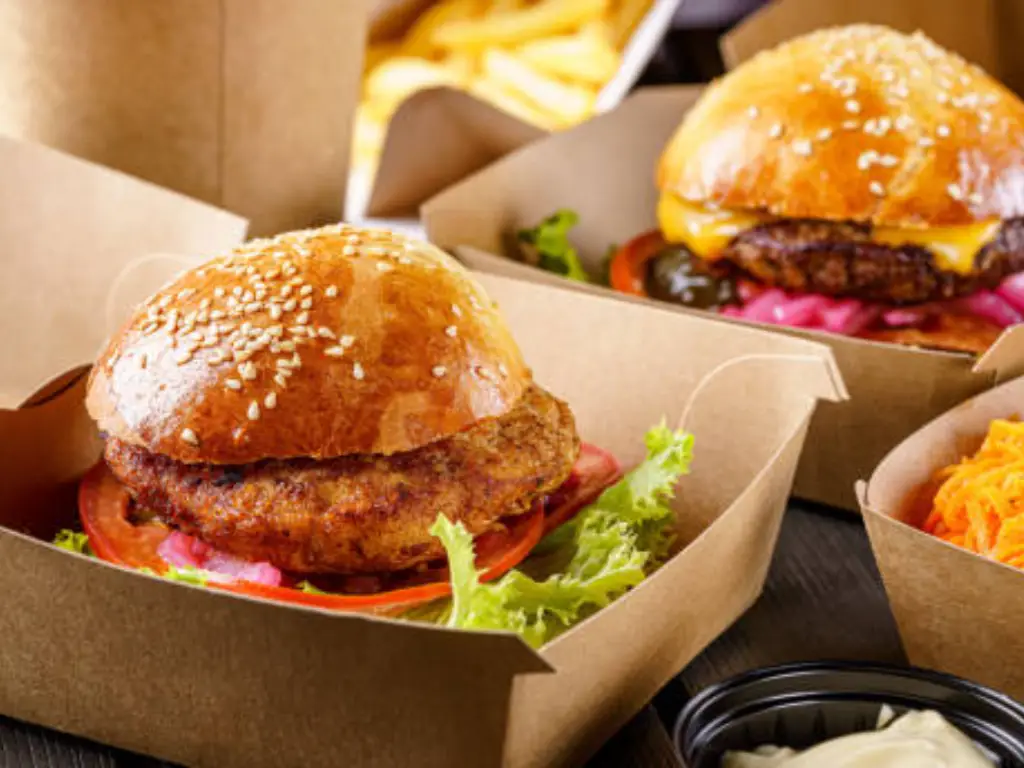
- ➔ If [Grease Resistance] + [Short Shelf Life Fast Food]: Then choose High-Grade PE or Aqueous Coated Kraft Paper.
Structural Engineering and Dielines
Once the material is selected, it dictates the Dieline—the flattened, 2D architectural blueprint of a 3D package. Designing without an accurate dieline provided by the manufacturing facility is akin to building a house without a surveyor's map.
A master file must clearly delineate Bleeds (the area where artwork extends past the cut line), Creases (the fold lines), and Safety Margins (the inner boundary where critical text must stay). The material thickness determines the crease depth. Furthermore, if a designer ignores physical realities—such as placing the vital UPC barcode too close to the top edge of a plastic pouch—the 200°C industrial heat sealer will melt and warp the ink during the sealing process, rendering the barcode unscannable at the grocery store checkout.
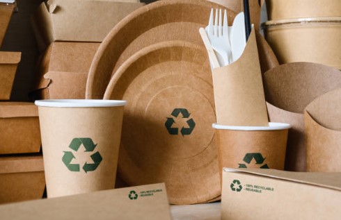
Eco-Friendly Realities: The Oxidation & Leakage Traps
The marketing allure of "Compostable" packaging is strong, but the physical reality is fraught with hidden dangers for both FMCG brands and the foodservice industry.
For FMCG snack brands (like potato chips or nuts), standard compostable films often suffer from catastrophic OTR failure. Oxygen passes right through, causing expensive high-fat solids to oxidize and develop a rancid flavor within weeks. For the foodservice sector, the danger is thermal breakdown. If a coffee chain switches to unlined pure paper cups to appear "green," the 85°C (185°F) coffee will quickly saturate the paper. Within ten minutes, cups collapse, leaking scalding liquids onto customers. Food contact materials must strictly adhere to both FDA (US) and LFGB (Europe) safety standards without compromising performance.
To execute these high-stakes environmental designs flawlessly, industry leaders rely on manufacturing powerhouses like YoonPak. Understanding the exact thermal dynamics of hot beverages and high-fat foods, YoonPak bypasses standard melting plastics. Instead, they pair premium SUN PAPER with advanced, heat-resistant CPLA (Crystallized Polylactic Acid) capable of withstanding 90°C+, or next-generation Aqueous Barrier Coatings. By offering FSC, BPI, and DIN certified solutions that physically outperform traditional materials, YoonPak empowers brands to launch 100% sustainable food packaging while entirely eliminating the risk of oxygen permeation and thermal leakage.
FDA Compliance and Legal Labeling Requirements
Perhaps the deepest fear for any food brand executive is not a poor sales quarter, but a sudden warning letter from the FDA, a customs seizure, or a mandatory nationwide recall initiated by major retailers. These catastrophic events are rarely caused by contaminated food; they are overwhelmingly caused by non-compliant packaging labels. Legal compliance is the absolute, non-negotiable prerequisite that dictates the visual layout from day one. You must strictly adhere to the guidelines set forth in the FDA CFR Title 21.
Mastering the Principal Display Panel (PDP)
The Principal Display Panel (PDP) is the portion of the package most likely to be seen by the consumer at the time of purchase. The FDA is ruthlessly specific about what must appear here:
- Statement of Identity: This is not your brand name; it is the legal, common name of the food (e.g., "Oatmeal Cookies"). It must be placed prominently, parallel to the base of the package.
- Net Quantity of Contents: The Iron Rule: This statement must physically reside within the bottom 30% of the PDP, in a font size strictly dictated by the total square inch area of the panel.
Nutritional Facts and Allergen Warnings
While the front of the package sells the product, the Information Panel keeps you out of court. Recent updates to FDA regulations have modernized the Nutrition Facts format, mandating that the Calories declaration be significantly enlarged and emboldened.
Furthermore, allergen warnings are a literal matter of life and death. Under the Food Allergen Labeling and Consumer Protection Act (FALCPA), the presence of any of the 9 major food allergens must be explicitly declared. Designers must ensure that no busy background patterns, drop shadows, or artistic elements obscure the "Contains" statement. An obscured allergen warning is a guaranteed trigger for a Class I nationwide recall.
Strategic Inputs: 2026 Food Packaging Design Trends That Convert
Before executing visual hierarchies, it is vital to inject conversion-focused strategies. In 2026, the only trends worth investing in are those that directly increase consumer trust, extend functionality, and lower Customer Acquisition Cost (CAC).
Transparent Windows and UV Considerations
Consumers have grown deeply cynical of hyper-stylized, airbrushed food photography. Integrating a transparent window into the packaging structure offers a massive trust premium. Seeing the actual physical product can increase point-of-sale conversion rates by upwards of 40%. However, this introduces a severe technical challenge: Ultraviolet (UV) light degradation. The design must incorporate advanced UV-blocking polymer coatings over the window, strategically placed to obscure broken crumbs that settle at the bottom during shipping.
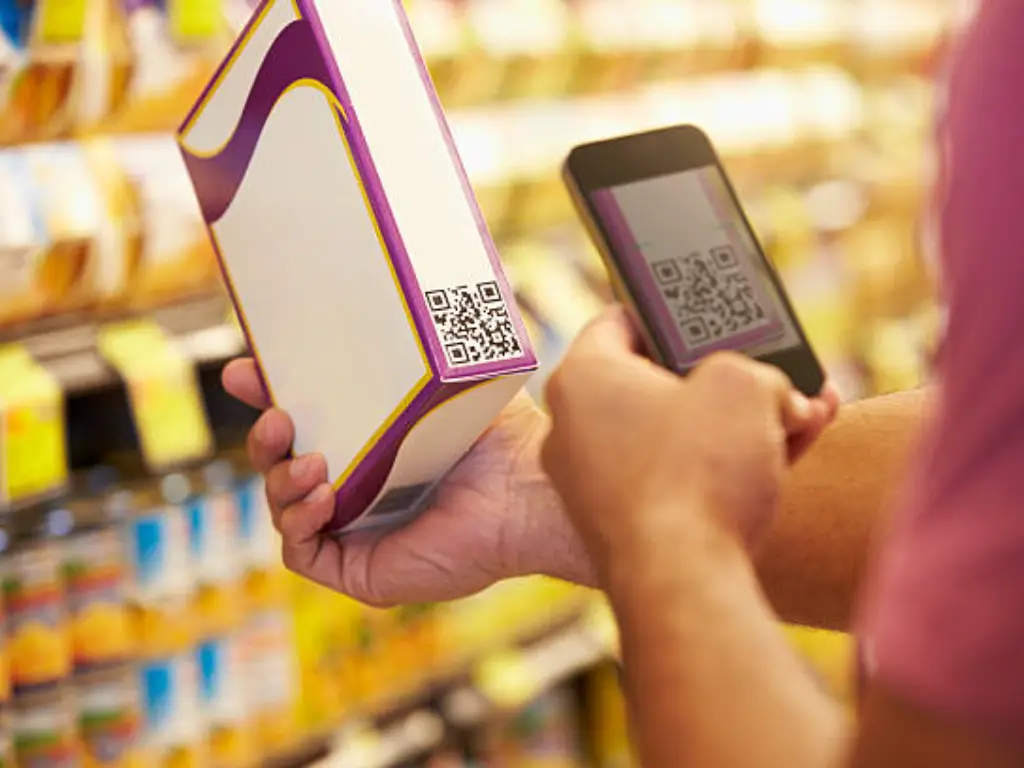
Smart Packaging and Interactive QR Integrations
Packaging is no longer a dead, single-use consumable; it is a highly active digital gateway to a brand's owned media. Smart design stops treating the QR code as an ugly afterthought banished to the bottom corner. Framed with a compelling call-to-action (e.g., "Scan to unlock 15% off your next Shopify order"), it turns an unavoidable packaging expense into a powerful customer retention tool, bridging the gap between physical retail and digital subscription models.
The Step-by-Step Visual Design Process
With materials, dielines, and compliance locked in, the focus shifts to visual psychology. Color plays a biologically hardwired role in food perception. Red actively stimulates appetite and urgency (heavily utilized by fast-food and snack brands), green has been permanently anchored to organic and health-conscious concepts, while blue must be used with extreme caution unless packaging seafood or dairy.
To optimize shelf impact, top-tier agencies employ the "3-Meter Rule." This dictates the visual hierarchy of information based on physical distance in a retail aisle:
- At 3 Meters (10 Feet): The consumer cannot read your text. They only perceive the overarching silhouette, the dominant brand color block, and the macro-shape.
- At 1 Meter (3 Feet): The consumer identifies the primary Brand Name and the bold Statement of Identity.
- At 30 Centimeters (In Hand): Only when the consumer physically picks up the item do the secondary claims, origin stories, and nutritional benefits come into play. If your design attempts to scream the detailed health benefits from 3 meters away, the packaging will look cluttered, desperate, and cheap.
Pre-Press and Production: Avoiding the Unprintable Trap
This is the final, most brutal reality check of food packaging design: The gap between a digital RGB file and physical factory output. Countless ambitious brands have spent thousands of dollars on brilliant graphic design agencies, only to take the files to a printing facility and realize their design is mathematically impossible to produce within their budget.
The Cost Abyss: CMYK vs. Pantone (Spot Colors)
If your designer utilizes an 8-color palette relying heavily on specific Pantone (PMS) spot colors, you will pay a massive premium in traditional plate fees. For every single spot color in your design, the factory must physically engrave and mount a separate printing plate (ranging from $300 to $500 per color). For a startup doing a small initial test run, an 8-color design means your upfront plate costs will instantly eclipse the actual cost of the packaging materials.
The Minimum Order Quantity (MOQ) Stranglehold
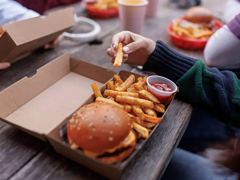
Traditional packaging giants operating massive rotogravure presses require incredible volumes to be profitable, routinely mandating Minimum Order Quantities (MOQs) of 50,000 to 100,000 units per SKU. If you have four different flavors in your product line, you are suddenly forced to warehouse 400,000 bags of untested inventory, forcing emerging brands into massive capital debt.
You do not need to let your budget die on exorbitant plate fees or six-figure inventory requirements. Progressive, modern supply chains have solved this bottleneck.
By partnering directly with YoonPak, brands bypass the "unprintable trap" entirely. YoonPak's internal engineering team provides Free Pre-press Optimization & Dieline Engineering, ensuring your structural files are factory-perfect and mathematically sound from day one, effectively filtering out common manufacturing errors.
More importantly, YoonPak radically lowers the barrier to entry: accommodating test-market launches with an MOQ of just 10,000 pieces (subject to freight terms). They seamlessly support both CMYK and Pantone color systems, utilizing state-of-the-art Flexo and Offset presses. This dual-capability ensures optimal cost-efficiency and flawless color reproduction across their entire range of paper-based packaging, from premium double-wall coffee cups to customized food cartons and bowls.
To completely eliminate the terror of the "first run," YoonPak delivers digital proofs within 1 working day and guarantees rapid sample dispatch within 48 hours. (Note: Standard factory samples are provided free of charge, while custom-printed design samples are available for a nominal fee, with freight collected).
Don't let your brilliant design die as an unprintable rendering on a screen. To secure accurate structural dielines and request your 48-hour rapid physical sample, contact the YoonPak engineering team today and bridge the gap between creative vision and supply chain reality.