

Coffee Cup Design Ideas: From First Sketch to a Printed Cup
The sketch on the whiteboard looked free: a round logo, a color band, the shop’s name in a nice serif. Then the printer’s quote arrived, and every one of those choices turned into a line item. A plate for this color, a wider band meaning more ink, a size change meaning a new layout. That moment, when a design idea meets a production price, is where most coffee cup projects actually get decided. This article walks the whole distance: from collecting coffee cup design ideas, to fitting them to a curved blank, to pricing the result, to the checklist for delivery day.
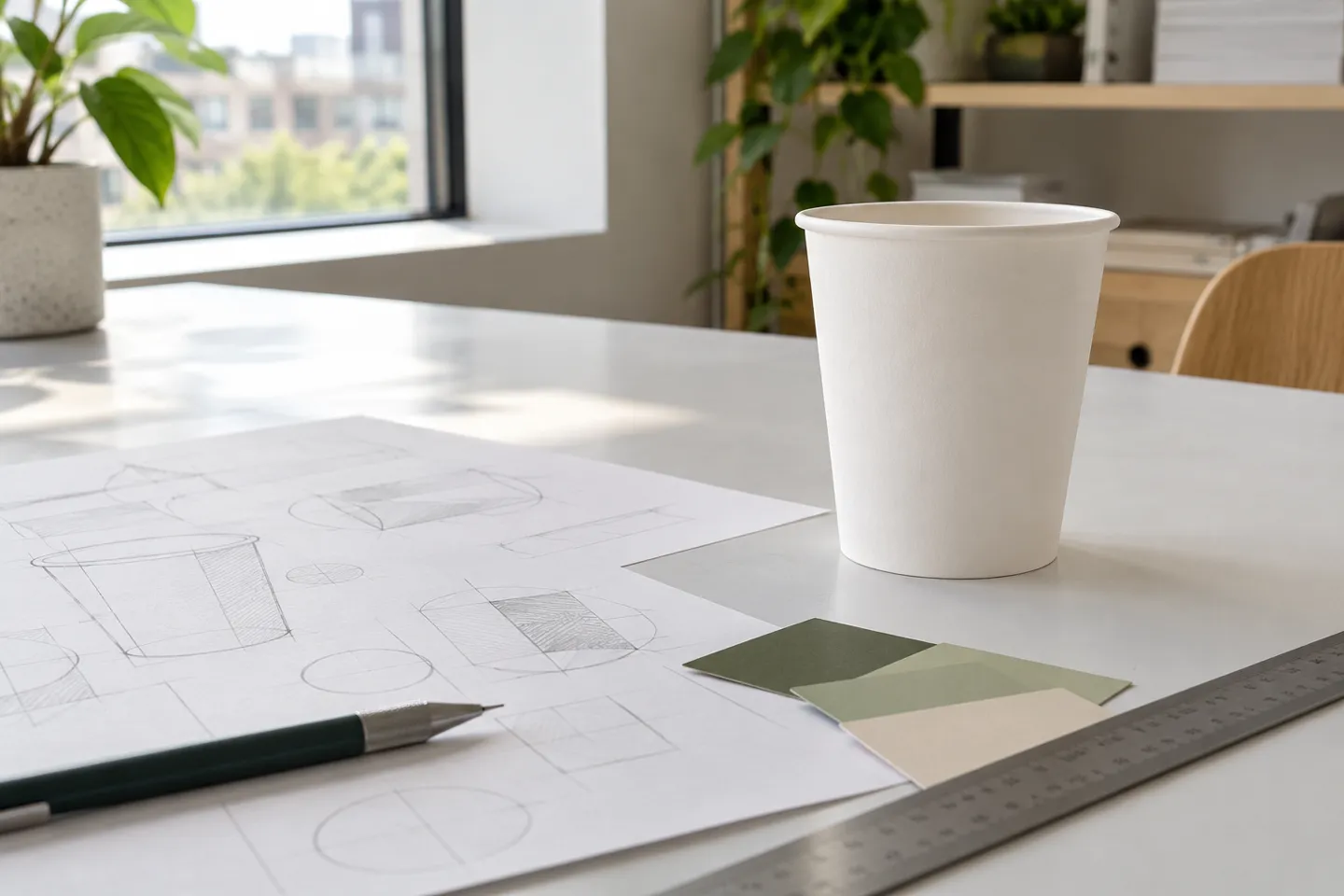
What You Are Actually Designing
One quick fork before anything else: this article is about disposable paper coffee cups, the to-go kind. If you came for ceramic mug painting or etched glassware, the ideas here will not transfer, because glaze, kilns and laser engraving obey different rules than ink on paper.
A paper cup is a curved canvas with three physical facts attached. First, it is a truncated cone, so your artwork bends and wraps, and what looks straight in the file curves in the hand. Second, only the outside wall carries print: the inside and the bottom stay unprinted, so everything you want seen must live on that one wrapped surface. Third, the cup is a system rather than a lone cylinder; the lid and the sleeve are part of the design too. A 12 oz single-wall cup, for example, measures roughly 89 mm across the top and 59 mm at the base, and every one of those millimeters is layout territory.
Every idea you collect falls into one of two buckets: what goes on the surface, or what the cup itself is made of. Most inspiration galleries only answer the first bucket. The rest of this article walks both, from surface ideas down to the wall under the ink.
The Design Ideas Map: Six Families and Their Price Tags
Galleries and Pinterest boards throw thousands of images at you, but nearly all of them sort into six families. Each row below names the look, the shop it suits, and the production consequence that gallery never mentions.
Six coffee cup design families and what they cost to print
| Design family | What it looks like | Fits best | Production reality |
|---|---|---|---|
| Minimalist logo and type | one small mark, generous white space, one or two colors | specialty cafes with confident branding | cheapest to print, one plate per color |
| Brand color band | a solid stripe wrapping the cup | chains and franchises chasing instant recognition | band width drives ink coverage, a white gap in the band cuts cost |
| Hand-drawn line illustration | doodles and line art in one ink | neighborhood shops with a playful tone | fine lines demand clean vectors and a printer who can hold small detail |
| Vintage pattern or art deco | repeating motifs, muted two-color palette | bakeries and retro-themed cafes | repeats work best as two spot colors, more colors multiply plates |
| Seasonal or limited themes | holiday art, drink-launch graphics | chains running promotions on a stable base | new artwork each season, sleeves can carry the seasonal layer |
| Kraft native style | unbleached brown cup, texture and one-color print | eco-positioned roasters and cafes | the material does the visual work, dark full-bleed on kraft drives coverage up |
One 2026 pattern is hard to miss while browsing those galleries: restraint. Single-color lettering, native kraft textures and small confident marks outnumber busy full-wrap illustrations. And the canvas is not shrinking. Globally the category keeps growing: paper cups are projected to rise from $11.73 billion in 2026 to $13.98 billion by 2034 (Fortune Business Insights, 2026). More brands will be making exactly this design decision. Not all six families cost the same; the differences come down to money, which is where the next sections go.
The Blank: Size, Dieline, Artwork
Designers get handed finished cups in portfolios and forget the cup started as a printed, die-cut blank wrapped around a mandrel. Working backwards from that blank solves most production surprises.
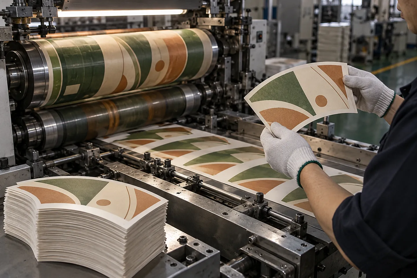
Choose the cup size before the artwork
Size is the boundary condition of the layout. An 8 oz wrap and a 16 oz wrap differ enormously, a mark sized for one sits wrong on the other, so lock the size first and design second.
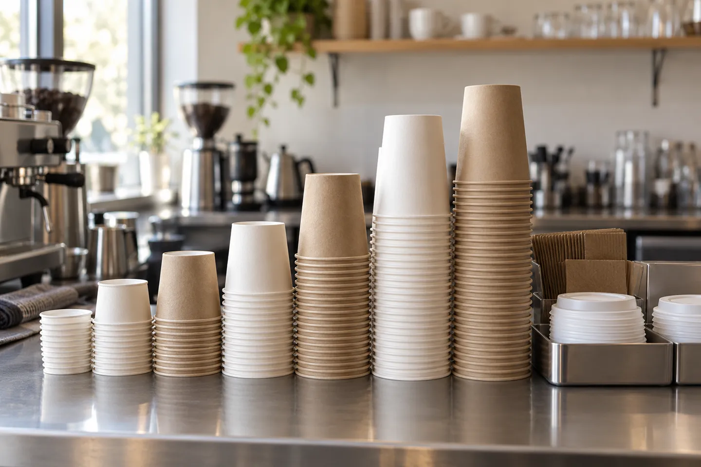
Common single-wall cup sizes and layout territory
| Size | Top diameter | Base diameter | Height | Typical use |
|---|---|---|---|---|
| 4 oz | 62 mm | 45 mm | 60 mm | espresso |
| 8 oz | 80 mm | 56 mm | 92 mm | short hot drinks |
| 12 oz | 89 mm | 59 mm | 112 mm | standard hot drink |
| 16 oz | 89 mm | 60 mm | 137 mm | large to-go |
Reading the table as a designer: the 8 oz and 12 oz cups share almost no usable layout geometry, and the 12 oz and 16 oz share a rim but differ in height by 25 mm. One design, re-laid-out per size, beats one file stretched across all sizes.
Get the dieline from whoever prints the cup
A dieline is the flattened, print-ready shape of that cone, with bleed and safe zones marked. Calculating it yourself is a common instinct, and usually the wrong one: press specifications differ from machine to machine. A designer working for a cafe in Thailand ran into exactly this. Their cafe wanted a print-ready file, and the designer wondered whether to build the truncated-cone layout by hand for an 8.9 cm top and 5.7 cm base. What worked: requesting the dieline from the print supplier instead (Reddit, r/Packaging, 2026). Ask the supplier for the template before designing, not after.
Artwork specs that survive printing
Cup printing has a short list of non-negotiables, and every one of them is cheaper to satisfy at the design stage than at the press. Vector files (.ai, .pdf, .cdr) at a minimum of 300 dpi keep edges clean at wrap scale. Convert text to curves so fonts do not travel as a liability. Decide CMYK versus spot colors before submitting, because that choice prices the job. A low-resolution bitmap enlarged to cup scale does not recover; it blurs, exactly where customers hold the cup at reading distance. Most manufacturers return a digital proof before printing, and the proof is where wrap position and text size get confirmed, so review it on a screen at full width, not as a thumbnail.
How Design Choices Become Money
Two quotes for similar-looking cups can differ by a third, and the difference is almost never a mystery. It is a readable sum of decisions made back at the sketch stage.
What each design decision costs
Flexographic printing, the standard process for cup walls, burns one plate per color. Plate cost per color is real but modest, and it repeats with every color you add (Gatherpackaging, 2026). A one-color logo is one plate; a six-color illustration is six plates plus six registration risks. Ink coverage follows the same logic: a dark full-bleed wrap drinks ink, while white space is free. Cafe designers already trade on this. One shop owner shared a disposable-cup design on a forum and worked through softening the palette, floating the idea of a white middle band with coffee-colored logo text to cut printing cost (Reddit, r/Coffee_Shop, 2021). Same brand, cheaper cup.
Every plate, color and freight line in this section is a line item YoonPak will price in writing before you commit to a run.
Request a Written QuoteThe cumulative effect shows up in real invoices. A Canadian cafe buyer reported paying about 15 cents per branded double-wall cup against 10 cents for the blank equivalent. Suppliers in the same thread noted that competitive custom pricing tends to open up around the 100,000-cup mark (Reddit, r/coffeeshopowners, 2025).
Not every budget starts at direct printing, and the brand mark has three possible homes. A stamp on blank cups or sleeves flexes with order size and forgives small runs, at the cost of precision. A printed sleeve keeps the underlying cup cheap and swaps themes per season, at the price of buying and stocking two items. Direct print wins the lowest cost per cup but carries the minimum order and the redesign bill, which is why growing shops tend to graduate from stamp to sleeve to printed wall (Reddit, r/Coffee, 2019; Reddit, r/coffeeshopowners, 2025).
One buyer’s invoice, per cup
A branded double-wall cup ran about 15 cents each against 10 cents for the blank cup, one cafe buyer reported. That 5-cent gap is the rent on a walking billboard.
Flexo or offset: pick by run and detail
Process choice follows volume and fidelity, not fashion.
Flexo vs offset for cup programs
| Dimension | Flexo | Offset |
|---|---|---|
| Setup | plates per color, faster makeready | higher plate and makeready cost |
| Economics | per-unit cost favorable from about 10,000 units | competitive on shorter, high-fidelity runs |
| Detail | bold graphics, solid spot colors | photographic gradients and fine typography |
| Inks | water-based options with lower VOC | oil-based litho tradition |
Sources: (Gatherpackaging, 2026)
For cup walls, flexo is the default because the substrate is a running web and the economics fit mid-to-high volumes. Offset-class detail, photographic gradients and hairline type, is where cup artwork goes to suffer, so simplify the artwork instead of forcing the process. If a design truly depends on photographic rendering, a printed sleeve produced on a flat sheet process is the honest workaround.
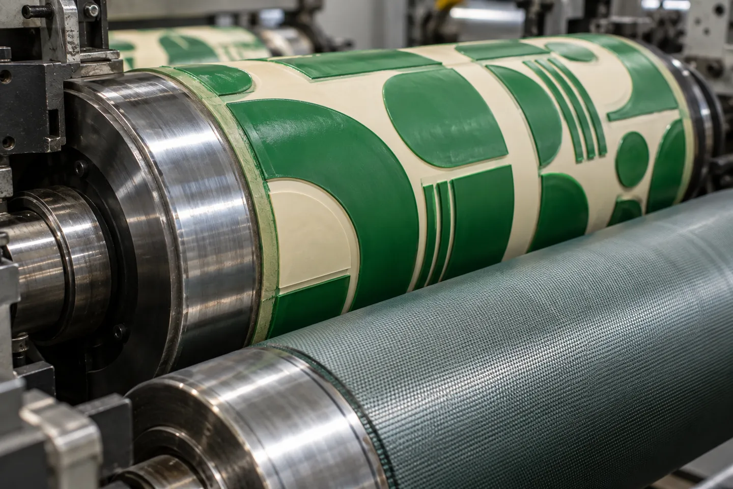
Locking color: CMYK simulation vs Pantone
A brand color built from CMYK dots drifts between presses and batches. A Pantone number is one ink and one reference, which is why multi-store programs specify PMS values in the order notes rather than hoping the press lands on the right brown. Spec the PMS number once and every future order has a target to hit. One more budget fact belongs here. The setup fee for custom printing is charged once per size, and unchanged reorders skip it entirely. That structure rewards a main cup design built to last, not redesigned each quarter (manufacturer FAQ on proofs, samples and fees, 2026).
Cup Wall and Accessories
Surface decisions are done; the cup under them still changes how the design reads in the hand.
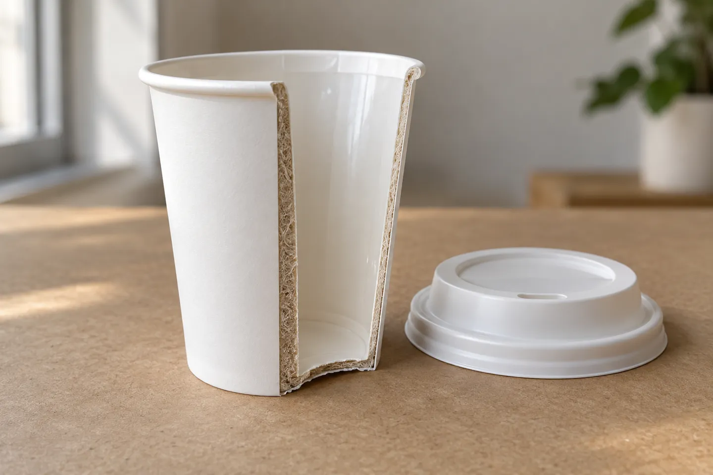
Single wall is the lightest and cheapest structure. Prints land sharp on smooth white board, but a bare single wall holding a near-boiling drink asks for a sleeve. Double wall bonds a second layer with an air gap in between, so the cup insulates itself and the sleeve disappears from the budget. Owners using branded double-wall cups report they hold up well in service (Reddit, r/coffeeshopowners, 2025). Ripple wall adds a corrugated outer ply that is itself a visual texture. On the 8 oz spec it is roughly three plies of board with an 18 gsm polyethylene lining. That corrugation punishes hairline artwork and rewards bold marks. Embossed insulated cups raise a pattern into the outer wall, which stiffens the cup and stacks compactly for storage. Its embossed surface takes up to eight colors in water-based ink (single-wall and emboss cup product specs, 2026).
Cup wall structures: design and boundary matrix
| Wall type | Heat in hand | How the design reads | Best for | Boundary check |
|---|---|---|---|---|
| Single wall | hottest, needs a sleeve or careful pour | sharpest print on smooth white | budget programs, mild drinks | pair with sleeves for very hot service |
| Double wall | comfortable, no sleeve | same print surface as single | to-go programs skipping sleeves | higher unit cost than single |
| Ripple wall | cool outer texture, strong grip | corrugation distorts fine lines | bold graphics, no-sleeve programs | avoid hairline detail and tiny type |
| Embossed | insulated, rigid | pattern adds light and shadow, up to 8 colors | premium branded programs | confirm lid fit and stacking height |
Lids follow rims, not preferences: an 8 oz hot lid seats on an 80 mm rim and a 90 mm lid on the 12 and 16 oz family, so lock the rim before ordering lids. Sleeves deserve one more sentence as the second canvas. They carry seasonal art while the main cup holds the permanent brand, which decouples the campaign calendar from the plate budget.
From Approved Artwork to Delivered Cups
Between the approved design and the delivery dock sit five checkpoints, and each one has a thing to verify.
Digital proof: most manufacturers return one within one business day of the order. Check wrap position, colors and smallest text on the real proof.
Samples: standard-design samples are typically free; custom artwork samples cost money and shipping. Approve a physical sample before mass production.
Production QC: serious plants check every hour. A failed check scraps everything produced since the last passing one, and a date, time and serial number under the base keep every cup traceable.
Lead time and freight: standard printed orders run 3-6 weeks. Approvals dragged past three days push the date. Sea freight dominates, and full-container mixed loads cut unit logistics cost.
Acceptance: custom printed products carry an industry-standard plus or minus 10% quantity variance. Food-contact documents (FDA, LFGB) and system certificates (ISO, BRC, FSC) should arrive as files, not verbal assurances.
Sources for the checkpoints: (manufacturer FAQ, 2026; production process page, 2026; Reddit, r/coffeeshopowners, 2025)
The sample step deserves its weight. Suppliers in the cafe-owner thread recommended demanding samples first and checking construction, coating and print quality on hot drinks before any bulk order. One buyer’s confidence in an overseas supplier came precisely from holding the physical cups (Reddit, r/coffeeshopowners, 2025).
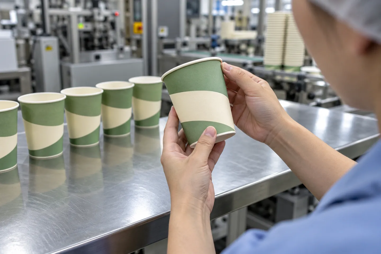
The Business Read: Design as a Buying Decision
Read the same facts again with a P&L open and they rearrange. A branded cup at about 15 cents against 10 cents blank means the brand pays roughly five cents per impression that walks out the door. The impression then keeps working on the subway, in a customer’s photo, at the next meeting table, for less than almost any paid local medium. That gap is not a cost of doing business; it is a media buy with a lid on it.
The budget structure follows. Print the brand directly on the main cup and lock it to a Pantone number. Every store, every batch and every reorder should land on the same color without negotiation. Demote the sleeve to a seasonal layer so campaigns can change while the main plate investment holds. And since the setup fee is one-time per size, a main cup built to survive several seasons amortizes that fee toward zero.
When quotes come in, price them in four steps instead of comparing naked unit prices. Count the colors, because each one is a plate. Match the process to the run length and the level of detail. Demand certification files rather than slogans. Then compare the quantity break steps, which on cup product pages sit at 50,000, 100,000 and 500,000 units. Two quotes rarely differ where buyers first look; they differ at the color count and the certificate.
One honest boundary closes the loop: below roughly ten thousand cups, plates struggle to pay for themselves, and stock cups with a stamped or printed sleeve is the answer that keeps the brand moving until volume grows. For distributors, the same four steps plus a documentation pack per item is what separates a listing that survives an audit from one that does not.
Compare your own sketch against the four-step check above, then browse YoonPak’s custom paper coffee cups range and ask for the one-business-day digital proof before committing to a run.
Print Your Coffee Cup Design With YoonPak
Send your artwork, approve a physical sample, and lock your Pantone number before mass production.
Start Your Custom CupReferences
- Fortune Business Insights. “Paper Cups Market Size, Share | Growth Report [2026-2034].” 2026. https://www.fortunebusinessinsights.com/paper-cups-market-105010
- Gatherpackaging. “Flexo vs Offset Printing: A Packaging Buyer’s Guide.” 2026. https://gatherpackaging.com/blogs/gather-packaging/flexo-vs-offset-printing
- Reddit, r/coffeeshopowners. “Customize coffee cups.” 2025. https://www.reddit.com/r/coffeeshopowners/comments/1ok3lgr/customize_coffee_cups/
- Reddit, r/Coffee_Shop. “My Design For Disposable Coffee paper cup.” 2021. https://www.reddit.com/r/Coffee_Shop/comments/pv1luc/my_design_for_disposable_coffee_paper_cup/
- Reddit, r/Packaging. “Do I need to provide a dieline for paper cup printing?” 2026. https://www.reddit.com/r/Packaging/comments/1scqe8d/do_i_need_to_provide_a_dieline_for_paper_cup/
- Reddit, r/Coffee. “Coffee shop owners – cup logo vs sleeve logo?” 2019. https://www.reddit.com/r/Coffee/comments/bax12t/coffee_shop_owners_cup_logo_vs_sleeve_logo/

 English
 German
 Spanish
 Italian
 Dutch
 French
 Portuguese
 Russian
 Arabic
 Korean